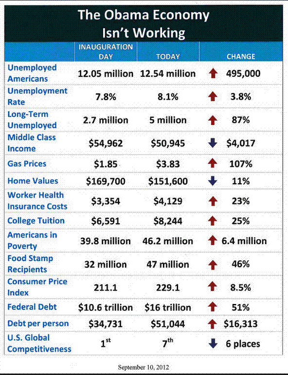
I have picked on just a couple of the items on the chart.
USA Umemployment
In Jan 2008 was 5%, by Jan 2009 it was 7.8% - A rise of 2.8% in one year under GWB. The rate continued to rise for another 8 months, hitting a peak of 10% in October 2009 (a further rise of 2.2%). Since then, it has fallen and is now at 8.3%. Yes, this is higher than when Obama took office, but given the rate of climb under GWB this is pretty damn good. Just turning the ship around in 8 months so stop the climb in the rate of unemployment was an achievement in its own right. (Source - U.S. Bureau of Labor Statistics Last updated: Sep 3, 2012)
http://www.google.co.uk/publicdata/...0&tend=1342220400000&hl=en_US&dl=en&ind=false )
Oil Prices
The cost of a barrel of crude oil has over doubled from $46.34 in Jan 2009 to $96.42 today, so a doubling in the price of gasoline is to be expected. The president of the USA has no control over oil prices, so the statistic on the chart is actually meaningless. (Source – NYSE
http://www.nyse.tv/crude-oil-price-history.htm)
House Prices
According to
http://ycharts.com/indicators/average_sales_price_for_new_houses_sold_in_the_us the average house price in January 2009 was $245200 and is now $263200 which is up, not down.
These are just a 3 of the items on the chart (no source quoted for any of the figures given), so make of the validity of the rest of the chart as you will.
Sam - If you are going to produce a list of figures like this, then each figure needs to be backed up with the source of the information, and be put into context. For example, the Unemployment figures may be correct, but they are misleading.