UNI WATCH POWER RANKINGS -- Click team names to view uniform sets
Rank Team Logo League Comment
1
Montreal Canadiens
NHL
Proud standard-bearers for a league, a sport, a nation and now for the uni-verse as well, the Habs have it all: an iconic logo, two distinct but equally classic uni designs (it's odd that the wraparound chest stripe only appears on the home jersey, but the road design works fine without it), and an ideal balance of red, white and blue. This isn't just a perfect hockey uniform set -- it's a perfect uniform set, period. Unlike the old-school classics in the other sports (Yankees, Celtics, Raiders), it has some major visual pizzazz. Puts the biscuit in the basket, and then some.
2
Chicago Bears
NFL
True, the helmet design is starting to look a tad dated. But the striped sleeves, striped socks (now a rarity in the NFL, alas), unique number font, and even the perma-memorial to Papa Bear all score major points, and the Bears may be the only team in the league who look as sharp on the road as they do at home. The cream of the NFL crop.
3
St. Louis Cardinals
MLB
People like to gush over the Yankees' pinstripes, but the Cards' birds on the bat are every bit as iconic and have been around for almost as long. The only reason St. Looey isn't at the top spot of this chart is that the road uni basically just duplicates the home uni (the different cap color notwithstanding), which seems a smidge unimaginative.
4
Chicago Cubs
MLB
The Cubbies' uni set isn't as simple as it appears at first glance, but it sure is easy on the eyes. A classic home design. A seriously underrated road ensemble. Even people who dislike alternate jerseys would be hard-pressed to complain about the walking bear on the Cubs' blue jersey. Memo to Theo Epstein: Whatever else you change about this team, don't change what they wear.
5
Boston Bruins
NHL
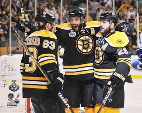
A traditionalist's dream, the Bruins' set has everything a hockey wardrobe should have: a strong, bold crest, sharp colors, tasteful stripes and a killer throwback option. First-rate.
6
Green Bay Packers
NFL
Green and gold is the perfect autumnal color palette for a fall sport, the road design just about holds its own with the home uni, and the Pack's helmet logo still feels vibrant and relevant (unlike, say, the Bears' logo, which is starting to feel dated). Green Bay also has leapfrogged ahead of most NFL teams by not switching to the new Nike collar. Only two quibbles: The TV numbers have gotten intrusively large, and my kingdom for some striped socks.
7
Pittsburgh Steelers
NFL
Some fans still haven't gotten over the Steelers' move away from block uni numbers 15 years ago, but the team's basic look is still as strong as ever. They're also the only NFL team with a logo on just one side of the helmet, a quirk that scores a few points in the intangibles column. Ditto for the cross sewn onto Troy Polamalu's jersey (which probably would prompt a fine if not for the fact that it's usually covered by his hair).
8
Oakland Athletics
MLB
When A's owner Charles Finley dressed the team in green and gold back in 1963, it was viewed as outlandish, even scandalous. Half a century later, Oakland's look has matured into a modern classic. Think of the A's as that outrageous-looking guy from high school who ends up looking surprisingly mature and sophisticated at the reunion (even if he does happen to be wearing white shoes).
9
New York Yankees
MLB
They deserve major credit for staying the course and avoiding trends (no throwbacks, no alternates, no names on the jerseys, no Cool-Flo batting helmets, etc.), but those pinstripes don't look so great in the pajama pants era (or when CC Sabathia pitches), the "NY" on the home jersey doesn't match the one on the cap, and the road jersey treads a fine line between minimalist and plain. An excellent wardrobe, but not quite the flawless masterpiece it's often assumed to be.
10
Boston Celtics
NBA
The Rolling Stones, "Goodfellas," a Hershey's with almonds -- the classics are classic for a reason. That definitely applies to the Celtics' set. No goofy side panels, no extraneous bells or whistles -- just a perfect vertically arched wordmark and a simple green-and-white color scheme. They'd jump a few more spots in these rankings if they dropped that black-trimmed alternate.
11
New York Rangers
NHL
The Rangers present the best argument for why the NHL should go back to having teams wear white at home: Their white design crackles with contrast and crisp highlights (arguably the strongest single uni in the NHL), while the blue set -- well, it's solid, but it doesn't have the razzle-dazzle of the white. Toss in an unnecessary but unobjectionable retro alternate and you have one of the NHL's best-dressed teams. Just wish they'd wear their top outfit at home.
12
Philadelphia Phillies
MLB
Pinstriped at home, gray on the road, and a beautiful retro alternate for afternoon home games -- that's how it's done, kids. Bonus points for the sleeve numbers (unique among current MLB teams), the chain-stitched chest insignia, the little stars dotting the i's, and of course the Liberty Bell logo on the socks and stirrups (for those smart enough to go high-cuffed, that is).
13
Oakland Raiders
NFL
Just suit up, baby. Silver and black look just as good today as they did when Al Davis came up with them. There's probably some marketer out there who wants the team to dress up like the fans in the Black Hole (and hey, that actually could be fun as a one-off thing), but you don't mess with something this elemental. Also: The Raiders are among the few NFL teams that wisely have declined to adopt the new Nike collar format.
14
Los Angeles Dodgers
MLB
When a team doesn't have any side piping on its pants, its home uniform tends to look whiter than white. Trot it out in some SoCal sunshine and you have a uniform that always looks crisp, fresh and contemporary, even though it essentially has not changed in 60 years. Of course, the near-perfect cap and chest logos don't hurt. Now if they'd just take the "LA" logo off the sleeve and replace it with a round patch of some sort.
15
Detroit Red Wings
NHL
Man, those Original Six teams got it right, didn't they? If you want to understand the difference between designing by hand and designing by computer, take a close look at the Wings' logo -- you'd never come up with that on a Mac. Bonus points for the vertically arched lettering on the player names.
16
San Antonio Spurs
NBA
The Raiders aren't the only team that knows how to wear silver and black. In addition to the killer colors, the Spurs are also among the few NBA teams that have successfully incorporated a graphic image into their chest typography -- a small element that goes a long way. Kinda wish they'd go back to the scoop-neck collar instead of the V-neck, but that's a minor complaint.
17
Philadelphia Flyers
NHL
After an ill-advised flirtation with black uniforms, the Flyers have gotten back to basics. Their current look is a sharp update of the design from their 1970s glory days. Some fans don't dig the contrast-colored nameplates, but other observers -- including this one -- really like them.
18
Los Angeles Lakers
NBA
Even for a confirmed purple-hater, the Lakers' uniforms have achieved the kind of rarefied status reserved for upper-echelon designs. The big fly in the ointment is the completely unnecessary white alternate. Come on, guys, you used to be special because you were the only team in the league without a white uni.
19
New York Mets
MLB
Last year, when they still had all of the black trim, the Mets would have charted in the lower third of these rankings. Next year, when they finally scrap the black alternate jersey (worn only twice this season, but it still counts), they'll rank even higher. For now, they've reclaimed their place as one of MLB's better-looking franchises. True Mets = Blue Mets!
20
Golden State Warriors
NBA
It was downright depressing to see a franchise with such a proud tradition of uni design innovation devolve into a pit of utterly generic tedium. But the Warriors' current set shows that this team -- and this league -- can still think outside the box. Too bad about the typeface (Copperplate Gothic is sooooo 1990s), but everything else here gets an enthusiastic thumbs up. Easily the NBA's most interesting uniform set, and also one of its best.
21
Toronto Blue Jays
MLB
Biggest before-and-after success story since Jared lost all of that weight eating at Subway. Last year, the Jays were in the running for the worst-dressed team in North America; this year they're among the best, thanks to an ingenious makeover that provides a snappy updating of the team's early 1990s look. A textbook case of how a team can acknowledge its past while embracing its future.
22
Utah Jazz
NBA
Right, we all know it's silly to have a team in Utah called the Jazz, but so what? There are no lakes or trolleys to dodge in L.A., but nobody complains about the Dodgers' and Lakers' names. Team names aside, the Jazz's current set is a beauty, and it's so much better than all of the purple and teal nonsense they'd been using previously.
23
Toronto Maple Leafs
NHL
If you like stripes -- especially striped socks -- then you're gonna like the Leafs. If you don't like stripes, well, the Leafs probably aren't for you. But if you don't like stripes, why are you reading Uni Watch to begin with? Another case of an Original Six team that totally gets it.
24
Detroit Tigers
MLB
Did you know that the Tigers use two different "D" logos for their jerseys and caps? It's true! It's an amusing quirk, but it also has practical implications, because the cap version of the "D" is much more crimped, less expansive, and as a result the team's cap logos look too small, too constricted, especially on the road cap. No, it's not a huge flaw, but it's still irksome, like a mosquito buzzing around your ear. Just punch up that logo a smidge, or put a white outline around the road logo. Or better yet, just use the jersey version of the logo. But don't change anything else, because the rest of this uni set is darn near perfect.
25
Kansas City Royals
MLB
Even in an age of 24/7 media coverage, the Royals largely have flown under the radar. They've been so bad for so long, they're never on national TV, and most fans outside of Missouri probably can't name more than three players on the roster. But for all of the franchise's flaws, its uniforms are badly underrated. Granted, it's not a groundbreaking design -- basically Dodgers Lite -- but if you're going to lose all of those games, you might as well look good while doing so.
1-122 at link:
http://espn.go.com/espn/playbook/st...rankings-rates-nfl-mlb-nba-nhl-uniforms-1-122


